Post by Ratty on Apr 7, 2009 13:11:49 GMT -5
Okay, I like Charby the Vampirate. It's one of my favorite webcomics and it's has an awesome story, cool characters and it's very well drawn. But after reading through some of the newer Charby comic, I've found some stuff that could be improved. I thought "Hey, maybe I should tell Amelius about this" and then started looking through the comic for other things I could give some tips about. So after looking through it for a while, I've found things that can be improved.
As I said, I like this comic, I'm not bashing it or flaming or whatever you crazy kids call it these days. These are just some tips to help Amelius (and maybe the others who read this) to improve.
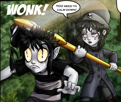
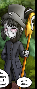
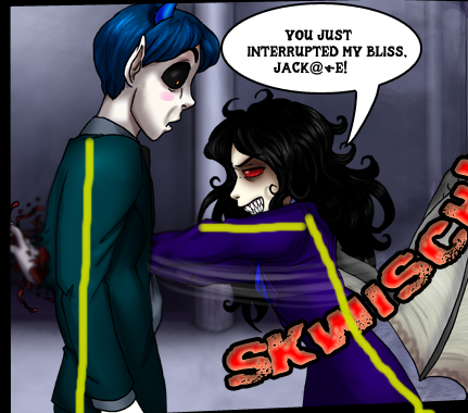
A lot of the time, especially in action scenes and stuff, the characters and poses look stiff and sort of... not alive. I dunno. Hard to explain. Here's an example.

See what I mean yet? That doesn't really look like a shove, more like he's just holding his hand there. They look sorta like... posed action figures. This is a pretty common thing that lots of people do, heck, I still do that sometimes.
The solution: Lines of action!
The line of action usually follows the spine and curves in a C or a S shape, depending on the pose. It's useful since it makes the picture a lot more flowy and less stiff.
I'm... really bad at explaining so here's an example.
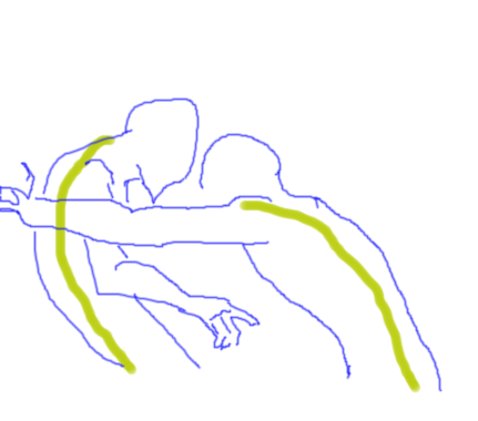
How to fix it: Watch Disney movies. No, I'm serious. Animators are experts at making drawings flowy and alive looking. I recommend Tarzan if you're working on drawing people. Pause the movie, try find where the line of action is, and copy the pic. Unpause, pause again, draw, and so on.
Another common problem I've seen: Shading with black and white, or just a shade darker than the main color. This works if you're drawing a character reference or something without a background, but not really in a comic.
Shadows have different colors depending on the light and background and what color the objects they're close to is. In other words, if the background is blue-ish, shade with dark blue or something. If the background is red, shade with a red-ish color...you get the point.
Here are some things I noticed with the newest comic.
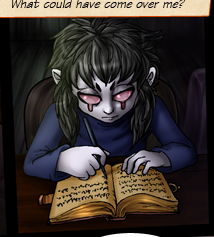
I'm assuming the bug is the main light source here. In that case the white highlighting should be green.
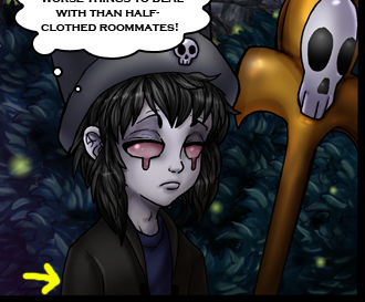
If the background is green, the reflected light there should be green too, not white.
Lesse... How to fix it... Well, there's the easy way or the hard way. The hard way is to study how light and shadows and stuff work, and practice a lot.
The easy way is to use Photoshop. Pick the color the light is supposed to have, make a new layer over it and flood fill the panel with that color. Then set the layer to Overlay and adjust opacity until it looks good.
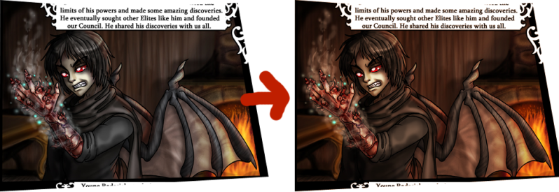
Tadaaa!
And because getting nothing but critique is boring, have some praise.
Charby the Vampirate is awesome, the story is good and all the characters are cool. ^^ And I love the expressions look. You can really see what the characters are thinking or saying and it's way better than anything I could do. Keep it up! ^^
...I think I forgot something here but bleh.
As I said, I like this comic, I'm not bashing it or flaming or whatever you crazy kids call it these days. These are just some tips to help Amelius (and maybe the others who read this) to improve.
A lot of the time, especially in action scenes and stuff, the characters and poses look stiff and sort of... not alive. I dunno. Hard to explain. Here's an example.

See what I mean yet? That doesn't really look like a shove, more like he's just holding his hand there. They look sorta like... posed action figures. This is a pretty common thing that lots of people do, heck, I still do that sometimes.
The solution: Lines of action!
The line of action usually follows the spine and curves in a C or a S shape, depending on the pose. It's useful since it makes the picture a lot more flowy and less stiff.
I'm... really bad at explaining so here's an example.


How to fix it: Watch Disney movies. No, I'm serious. Animators are experts at making drawings flowy and alive looking. I recommend Tarzan if you're working on drawing people. Pause the movie, try find where the line of action is, and copy the pic. Unpause, pause again, draw, and so on.
Another common problem I've seen: Shading with black and white, or just a shade darker than the main color. This works if you're drawing a character reference or something without a background, but not really in a comic.
Shadows have different colors depending on the light and background and what color the objects they're close to is. In other words, if the background is blue-ish, shade with dark blue or something. If the background is red, shade with a red-ish color...you get the point.
Here are some things I noticed with the newest comic.

I'm assuming the bug is the main light source here. In that case the white highlighting should be green.

If the background is green, the reflected light there should be green too, not white.
Lesse... How to fix it... Well, there's the easy way or the hard way. The hard way is to study how light and shadows and stuff work, and practice a lot.
The easy way is to use Photoshop. Pick the color the light is supposed to have, make a new layer over it and flood fill the panel with that color. Then set the layer to Overlay and adjust opacity until it looks good.

Tadaaa!
And because getting nothing but critique is boring, have some praise.
Charby the Vampirate is awesome, the story is good and all the characters are cool. ^^ And I love the expressions look. You can really see what the characters are thinking or saying and it's way better than anything I could do. Keep it up! ^^
...I think I forgot something here but bleh.


