|
|
Post by Daggertooth on Jul 2, 2006 10:30:20 GMT -5
Hey all, I never thought I would have one of these but I've doodled a little and thought it was time to ask for help. You see I haven't taken an art class in over 10 years, jr high, and I really have no idea what I am doing. Many can attest that my first question about art was, "what side of the paper do I use?" So I'm asking for coments, advise, and constructive critisism. Be as truthful as you can as thats the only way I can learn. At this moment in time I am working a little on basic coloring. These two drawings were done only in photoshop and are suppose to be balls, can you get any more basic? As real as possible. Or at least looking good. 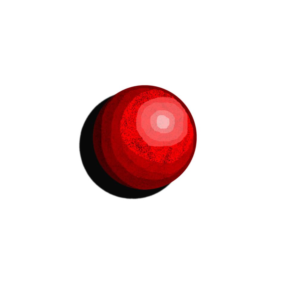 I still haven't got the shading down, I was doing a 70% opacity with shading and can't seem to get rid of the contrast between light and dark shadows. The "drop shadow" affect was good untill the background was nothing but white. Now it looks solid and almost part of the ball.  I actualy like this one, but it is quite different that the initial consept. It was suppose to be a soccer ball but the shading, which I chose to cover the entire ball in closely fitting lines, ended up looking better than the ball itself. I learned that closely contrasting shades kind of blend together. The grass is blurred to death in the background in an attempt to show distance. I've also learned something rather interesting....the smaller the picture the better they look.   Like always I love constructive critisism and advice. Anything to help me out and make me better at drawing. Daggertooth |
|
Raccoo
Full Member
   Booga booga!
Posts: 130
|
Post by Raccoo on Jul 2, 2006 12:12:14 GMT -5
What tool/s did you use for the first sphere's shading/highlighting? Were you trying for a perfect sphere or more of the ridged look? I'd suggest playing around with different tools, really just play around the photoshop. I think you're heading in the right direction starting with spheres. The shadow might look better if it weren't all black, if it varied in grayness a little.
|
|
|
|
Post by RyokoDragonez on Jul 2, 2006 13:58:11 GMT -5
Nice job on the second one. I honestly thought it was a photo in your Avatar. And yes, these things almost always do look better when they are smaller. (ALMOST always). Even I shrink the images before sending them 'public'.
Something you can do to get rid of ridges is to blend the colours by using a brush along the very edges of the ridges. Won't look so stark that way.
Once again... Love the second one. <3
---
Ryoko Dragonez
|
|
|
|
Post by Shippo_no_Neko on Jul 2, 2006 15:38:31 GMT -5
Very good! You could use the soften tool in the first one, or add a blure effect if you think your shadows are too strong. It's looking very nice so far! The second one looks great, and the first one looks cool, too ^^ My last teensy bit of constructive critisism is maybe in the first one, the white shine should be a little more right, and up.
|
|
|
|
Post by Daggertooth on Jul 3, 2006 10:04:41 GMT -5
What tool/s did you use for the first sphere's shading/highlighting? Tools? Um...well I used different layers. For highlights I made another layer and used 70% opacity. That was for pure white and black, for the other shades I Used the eyedropper on the shadowed black and white and got a slightly pinker white and black. Does that make sense? Were you trying for a perfect sphere or more of the ridged look? A perfect sphere....which is not what is going on. Seems the instant change in contrast brings some sort of 'edge' look to it. I'd suggest playing around with different tools, really just play around the photoshop. I think you're heading in the right direction starting with spheres. The shadow might look better if it weren't all black, if it varied in grayness a little. Well the shadow was a photoshop affect...I think it was the lack of a background that did that. Lesson learned. I'll play around with the tools, but I'm still uncertain at whats possible with photoshop. Nice job on the second one. I honestly thought it was a photo in your Avatar. And yes, these things almost always do look better when they are smaller. (ALMOST always). Even I shrink the images before sending them 'public'. Thanks!  I guess the smaller the picture the less visible the various imperfections. Maybe that means I should post everything blown up as much as possible. The picture was originaly 2000 X 2000 pixles. Is the PSD file suppose to be 50megs?
Something you can do to get rid of ridges is to blend the colours by using a brush along the very edges of the ridges. Won't look so stark that way. Blend the colors using a brush? Something different than blur? I'm a wee bit confused here. Very good! You could use the soften tool in the first one, or add a blure effect if you think your shadows are too strong. Whats the difference between blur and soften. As far as I can see they do the same thing. Burn can give people black eyes. :-p It's looking very nice so far! The second one looks great, and the first one looks cool, too ^^ Thanks! My last teensy bit of constructive critisism is maybe in the first one, the white shine should be a little more right, and up. Ah, so that the shadow and white shine are alligned all proper like. Gotcha. I think I'll actualy make a new ball instead of fix the red one. Zolah said she didn't like the white grass. That it wasn't very natural. The reason it is white was because I was using the grass brush and didn't know that both color panels dictated color. That was a very interesting and helpful thing to learn. So I fixed up the picture a little so that it is darker green. That said, I think the white makes it look like its a frosty wintery grass scene. Here is the slightly revised orb. 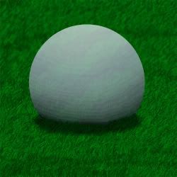 Oddly enough, the orb has a light blue/teal wavy lines at a very faint opacity...10%. I'm not entirely sure why I did that, but even though it is bairly visible the orb doesn't look as good without it. Odd.... 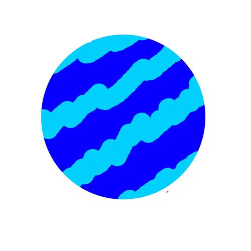 Daggertooth |
|
|
|
Post by Daggertooth on Jul 4, 2006 18:40:31 GMT -5
Alright I've worked a little bit and colored another ball. Even made a background for it. 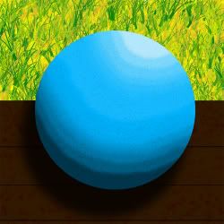 I found the Brush thing and it worked wonders for what I wanted. Once again I shaded the entire ball under a 70% opacity shadow gradient. Seemed to look better than letting the black specks suddenly become bright. The black at the bottom of the ball seems to contrast a bit much but that could have been fixed. The background was simple enough and I think works well. I really like the field in the background. Problem is I don't know how I did it. I used a green bush brush over some then went over the entire thing with a yellow grass brush. To my suprise the yellow grass brush colored everything between the green bushes but not over them. Great effect, but I don't know how i did it. That also happened a few times when I was shading and wanted to overlap the color but it wouldn't let me. How did that happen and how can I control it? Anyone know whats up with photobucket? I give it my 1000 X 1000 pixel picture to resize and expect something decent. Afterall it does specificaly state that it needs to be under 500kb. But the picture gets resized to 111kb...whats up with that? Daggertooth |
|
|
|
Post by Wolfy on Jul 5, 2006 15:59:58 GMT -5
Your resolution might be set too high.
|
|
|
|
Post by Scarecrow on Jul 5, 2006 22:26:40 GMT -5
Nice! Hehe, that's better shading than what I can do.
Also, how DO you resize stuff?
|
|
Raccoo
Full Member
   Booga booga!
Posts: 130
|
Post by Raccoo on Jul 5, 2006 22:46:36 GMT -5
In the gimp it's under Image>Scale Image
Not sure about other programs.
|
|
|
|
Post by Daggertooth on Jul 6, 2006 10:21:56 GMT -5
Well I create the canvas as a 2000 x 2000 pixel square. It has a starting resolution of 72pixels per inch and a RBG 16bit.
Thing is, I can't save it as a jpeg unless I change it to an RBG 8bit.
Anyone know how to fix this problem or to make my canvas better to use?
To alter the image size in photoshop you go to----> Image: Image size: adjust to what you want.
Daggertooth
|
|
|
|
Post by Zolah on Jul 6, 2006 11:05:00 GMT -5
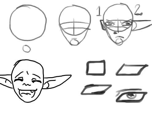 as dagger requested i made a litte tutorial on how to make faces ^^'' its harder to me to make a tutorial on the body since its harder on the comp  First make two cirkles, one big one and below that one a small. then connect them by making a line between them so it looks like an egg upside down. when thats ready you can make some lines wich will be helping you to draw the position of the face, you can keep the cirkles to help you but its individual if you like it or not. anyway, make 2 lines across the head. You can make it wider or more narrow depending on the eye size you want. also make on line straugt down in the middle of the face about where the nose shall be. and last make a line where the mouth should be. see the numbers? its just two diffrent ears, nr 1 is human while nr 2 is elf ear. 1: one is basically a square wich i have made a bit more rounded in th edges, you should put the ears about the same place as the lines where you put the eyes. 2: here is something diffrent, i always use a half cirkle to make my elven ears. mostly to get them wider and easier to make them exact like each other. otherwise i would give as a n advice to make elf ears not so much detail, but it can be me that is too manga inspired. Now to the fun part, adding eyes and other stuff. do this carefully and not too much detail since you are going to erase the helping lines. when that done you can concentrate on details, maybe lineart and colouring ^^'' how to draw an eye O.o first off i want you to imagine and eye as a square, ( try to draw one if you like ) then make a square that is tilting rather much to the side, this is the beginning of your eye. now make the corner to the upper left and lower rigth more smooth, almost so it dissapears. see ? it already beginning to become an eye. now you just need to add a pupil, and a eye lid. tadaa its finished ^^'' to make an eye more evil or nicer you just make the tilt in the cube diffrent, more it tilt more evil and feminime it gets. this was a very easy tutorial, i could makea beter one if i had a scanner  if you want anymore 'guides' just Pm or ask on the msn ^^'' k? |
|
|
|
Post by Daggertooth on Jul 17, 2006 12:54:39 GMT -5
Thanks a ton Zolah! I'll be playing with it every now and then when I can.  I drew another picture. Incase there are identification problems I will say now that it is an ant. I drew it up a bit fanticiful but its based on reality. The legs were the hardest to think of and I had to look at my picture of a gigus for inspiration....or practical tracing. 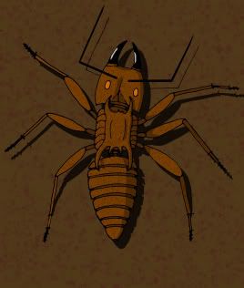 Anyone know why photobucket shrunk down the picture. I'm really frusterated about it. Does someone have a better picture storage site to recomend? Personaly I think there may be a few problems with some of the shading. Though I stuck with mostly one shade color as that seems to be the norm. The intersegmental membrane of the gaster have its own shadding and is overlayed with the shading of the side which kinda works. I was not about to play at having the intersegmental membrane being see through, I don't know ant anatomy enough to even give a hint at it. :-p Whiteshine sucks, kind of gives the impression of birdpoo. And the antennae could use a bit more work as it seems so blocky and its shadow seems out of place. The armor of the throax -seems- odd and the legs seem to have a bit of a splayed look to it. Not sure if I like how two of the legs are up in the air as shown by the shadow....but I fixed two others that did that. Otherwise I am really pleased with how this turned out. <---personal critisism. Anyone have any suggestions on how to make texture using other brushes besides the black speckle. It works but I think I've used it for everything. Daggertooth |
|
|
|
Post by Wolfy on Jul 17, 2006 13:37:49 GMT -5
Try switching your color scheme from RGB to CMY... that might make a difference... It's the color scheme we were always told to use in my Digital Media class.
|
|
|
|
Post by DarkfireTaimatsu on Jul 17, 2006 14:11:45 GMT -5
Photobucket shrinks pictures according to filesize, I think. But that's all I know. Not even how to avoid such.
|
|
cami
Junior Member
 
Posts: 90
|
Post by cami on Jul 17, 2006 17:08:06 GMT -5
I love the design on the ant, and you have great control over color.
|
|
|
|
Post by Daggertooth on Jul 25, 2006 10:23:13 GMT -5
Thanks all. I got a Deviant art now, odd since I am not an artist. But that does mean I don't have to resize things. At least untill i realize that the ant was originaly 2000 x 2000 pixels and monstrously huge. I've decided to try to get a bit of a profile look on the ant. Harder than anything to visualize. I ended up sketching a bunch of boxes and tried to place the ant in various places in that box. I swear I used up half my erasser. And when I messed up between good stuff and errassed everything then forgot where the good stuff was....a bit annoying actualy. I also found that it is particularly hard to draw round surfaces and make them look round. I mean I ended up drawing a line on the face and giving it an almost box look just so the face didn't lack shape. Well here's the sketch so far. It has been inked since the picture but I doubt I will be able to color it for a bit. Lots of stuff to do. If you have any comments, questions, or suggestions go ahead and speak your mind. Just know that the inking is already done.   Daggertooth |
|
|
|
Post by RyokoDragonez on Jul 26, 2006 1:56:58 GMT -5
Wow. That's awesome, Daggertooth. Your skill is really increasing~! Keep up the good work. And www.imageshack.us is a good image hosting site that doesn't shrink your images.
---
Ryoko Dragonez
|
|
|
|
Post by Seth Asathi on Aug 3, 2006 13:19:59 GMT -5
Man, even I'm learning stuff from this... How cool is that? Zo, nice tutorial on drawing faces. I couldn't do it before, but that changed rather quickly.
|
|
|
|
Post by Daggertooth on Aug 5, 2006 5:31:19 GMT -5
Yeah....good stuff all around. I'm still trying to color that ant. Things taking forever cause I'm having trouble visualizing lighting. I've also been changing small stuff like the lines and making them straiter or thinner or something. In the mean time I made another sketch. It's now inked and has serious problems with the shingles...they're just too flat and I can't seem to be able to give them that round look that they actualy have. Although I have an idea that will either work or ruin it. I'll try that later. I'll color the ant before this one methinks, but in the mean time you all can help me make this better. My first building. I'm not sure where it would go in the deviant art categories so I placed it in the landscape place. :-p  Daggertooth |
|
|
|
Post by Daggertooth on Aug 12, 2006 9:48:35 GMT -5
Hey all, finished the coloring for the ant.  Daggertooth |
|